Sonos: Rebrand
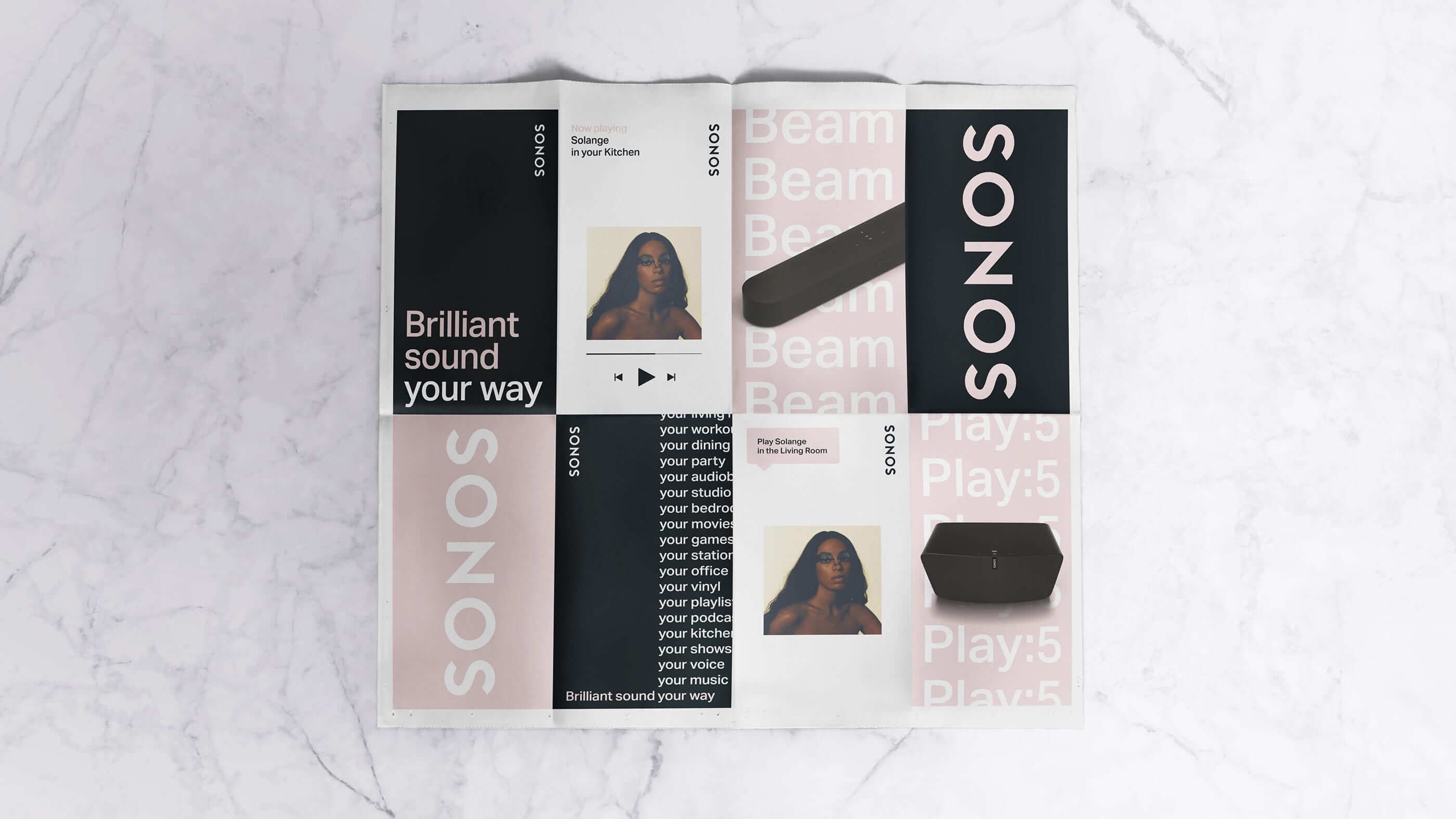
The new Sonos brand identity puts a fresh spin on the look and feel of the brand with a new approach to using color, illustration, typography, and some new design tools built for the future. Repositioning from 'The Home Sound System' to 'Listen Your Way', the new Sonos communications showcase the vast range of different ways to listen.
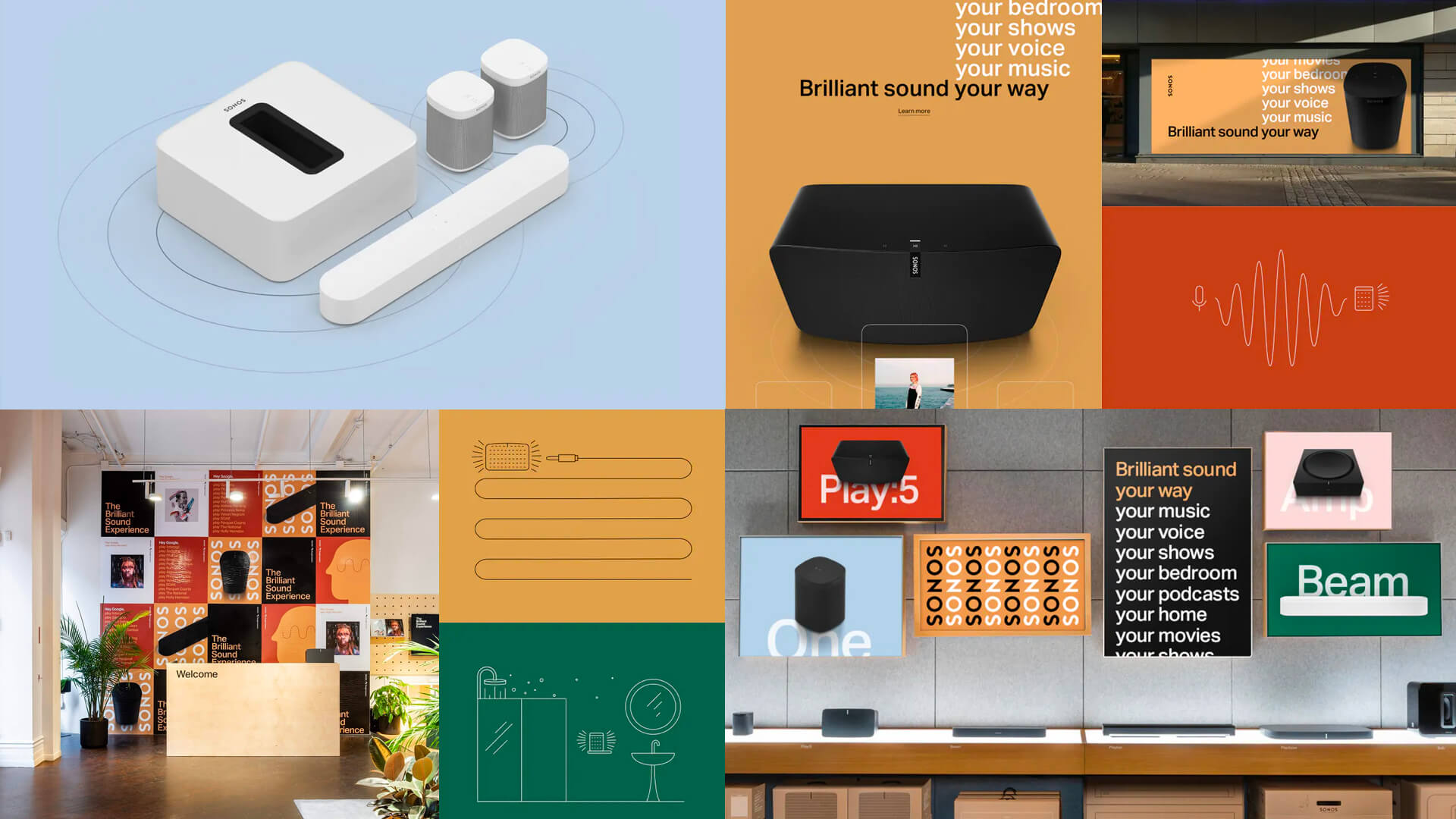
Being very rooted in Swiss design, the previous identity leveraged Helvetica as the brand typeface with black, grey and white as hero colors. In our refresh, we added a seasonal palette that can change with time. Season 1 is inspired by Sonos' roots and are rightfully named the Santa Barbara shades. Each color is chosen due to its ability to make Sonos' products shine.
In addition, we moved towards Aktiv Grotesk, a typeface which in many ways is a direct response to Helvetica, but optimzed for the digital age. While Aktiv shows many similarities to Helvetica, we set it completley different: expressive and melodic.
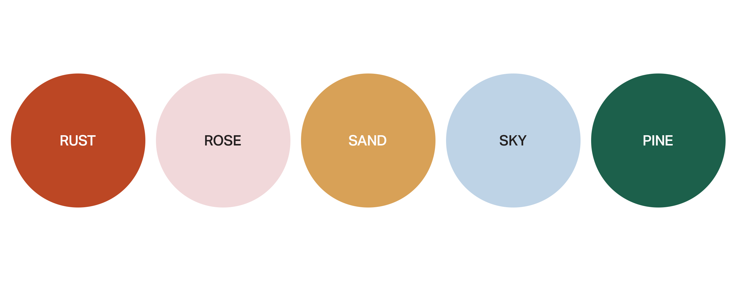

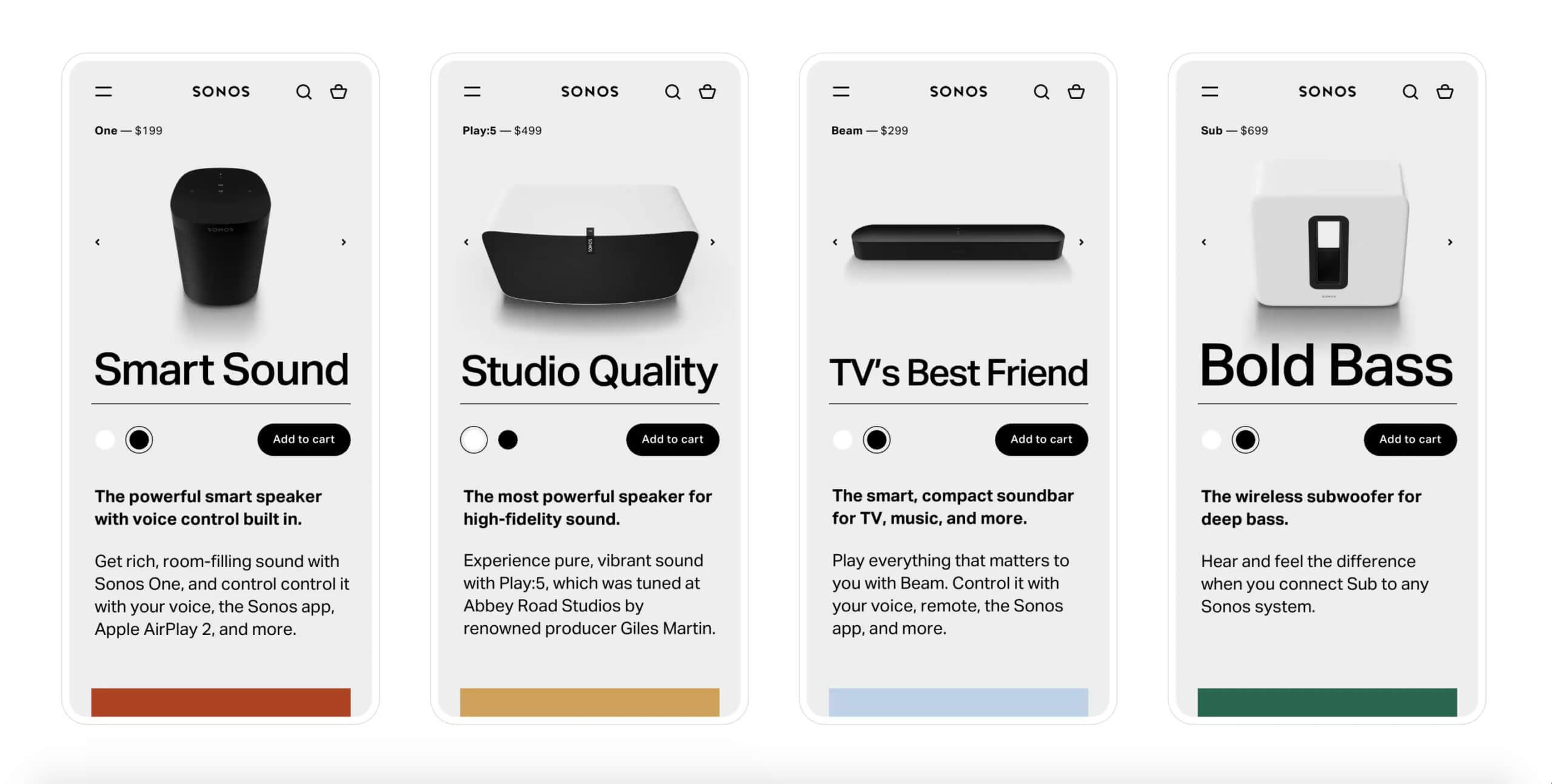
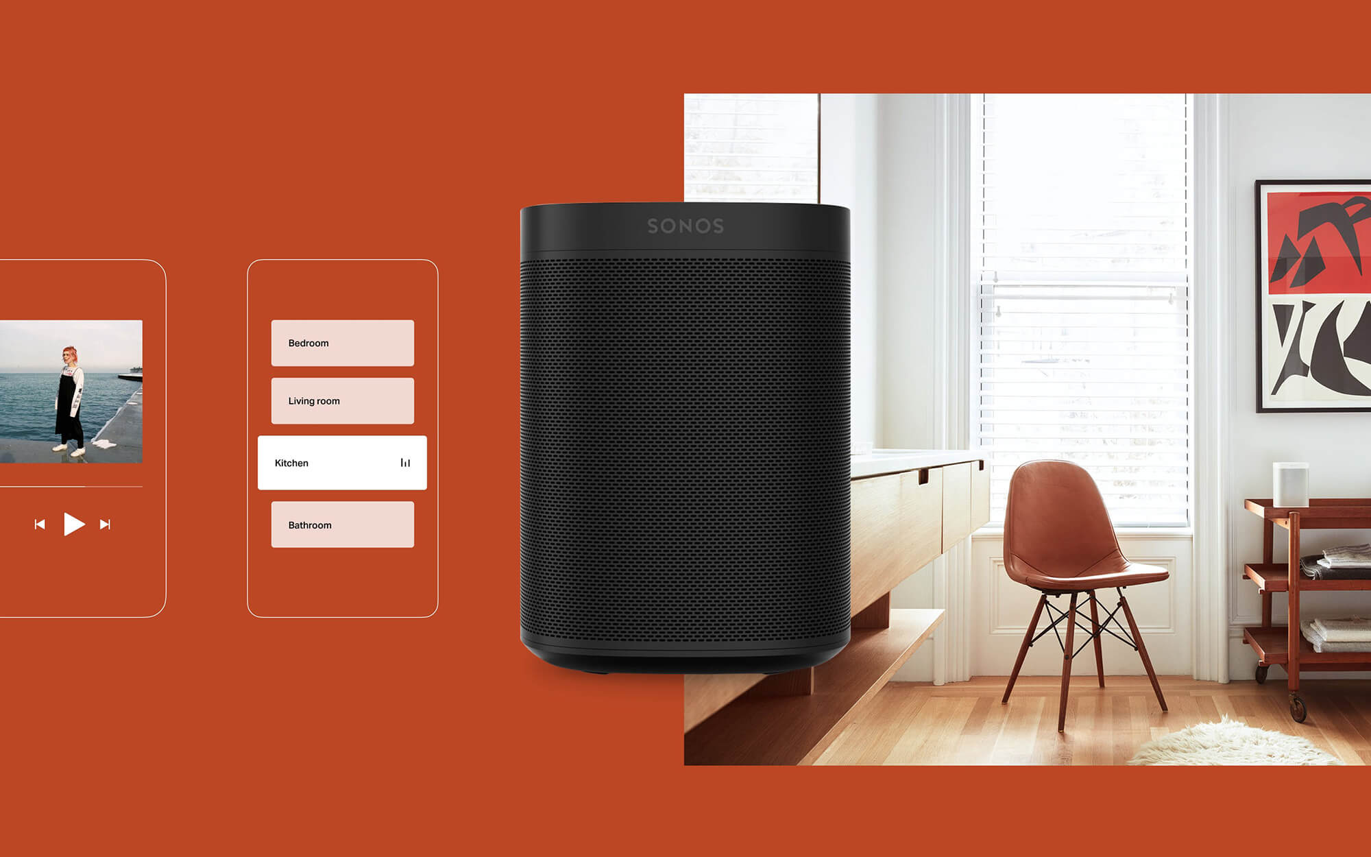
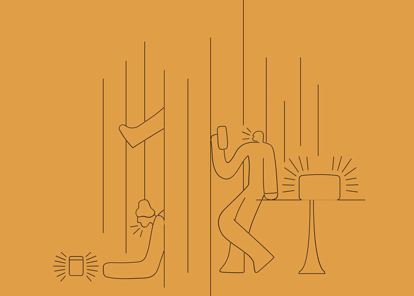
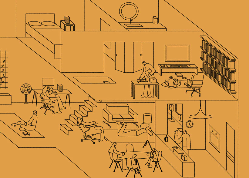
Illustration visualizes abstract concepts and simplifies complex ones. We use illustration to showcase the product experience, sound visualization, education, and envionments.
Illustration visualizes abstract concepts and simplifies complex ones. We use illustration to showcase the product experience, sound visualization, education, and envionments.
Illustration visualizes abstract concepts and simplifies complex ones. We use illustration to showcase the product experience, sound visualization, education, and envionments.
Illustration visualizes abstract concepts and simplifies complex ones. We use illustration to showcase the product experience, sound visualization, education, and envionments.
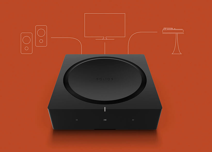
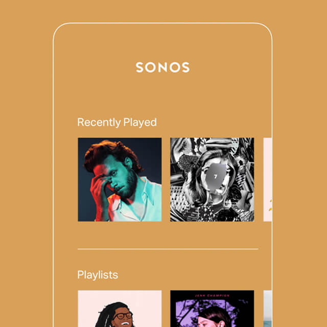
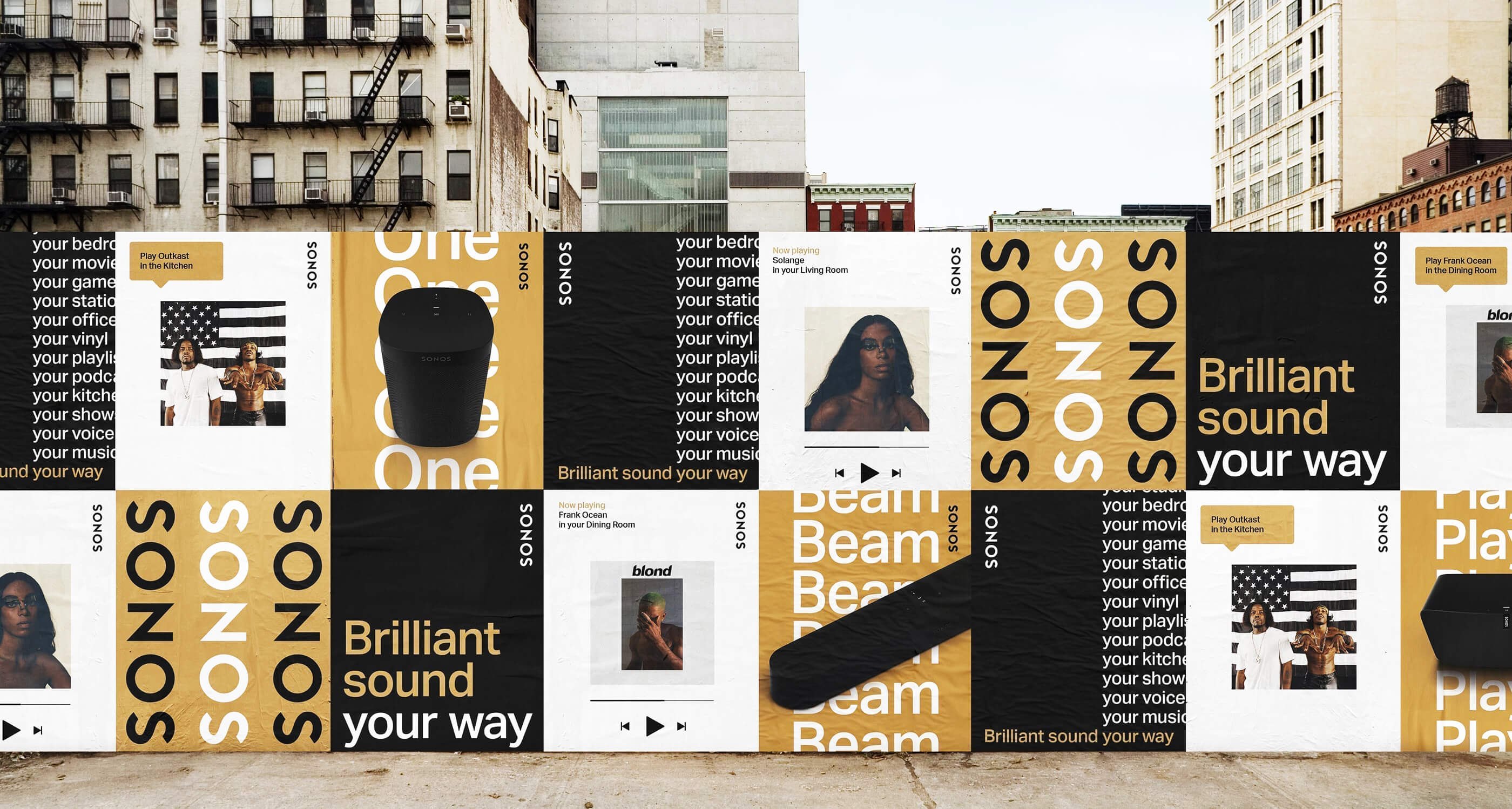
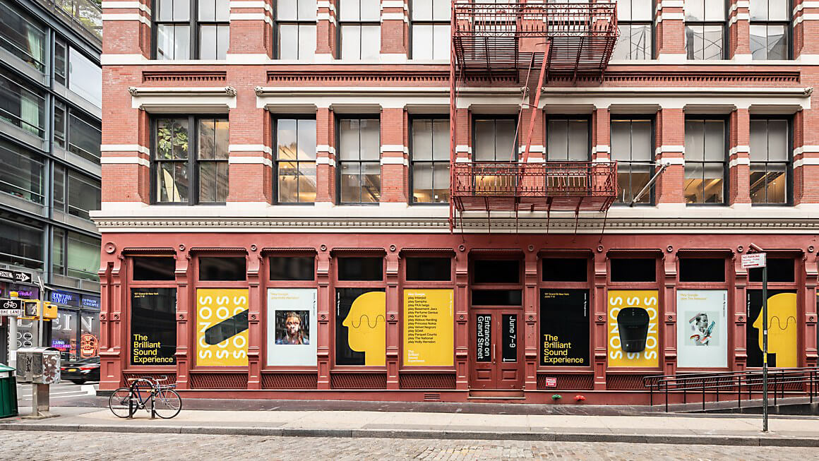
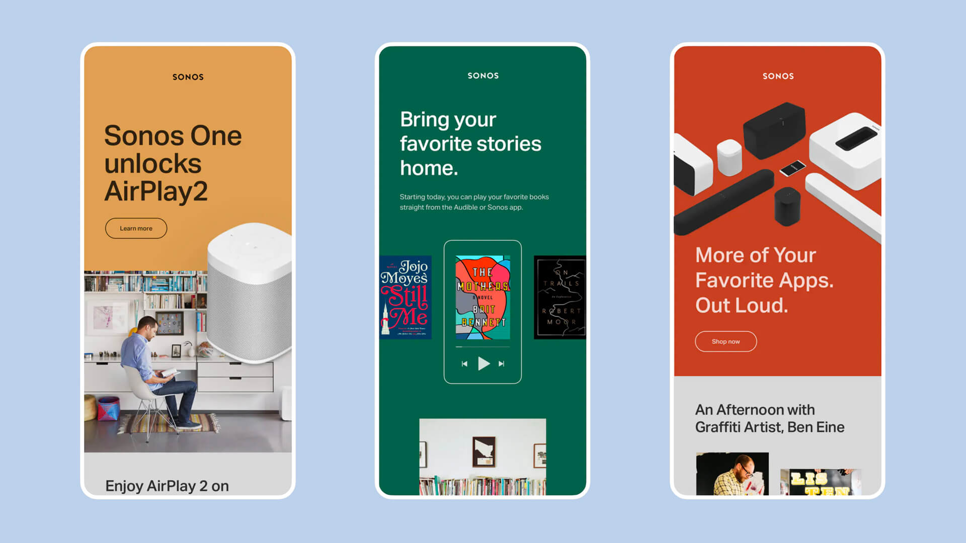
To roll out the new brand identity and voice, Sonos launched a global brand campaign with ads in Times Square, Rolling Stone magazine and other prominent placements around the world–as well a design refresh of key digital touch points like the brand’s global Instagram account, customer emails, and brand videos.
After we had finalized the look and feel, Sonos took the opportunity to completely redesign their website with digital agency, Instrument, using our assets.
AGENCY
AGENCY
AGENCY
AGENCY
Anomaly
Anomaly
Anomaly
Anomaly
ROLE
ROLE
ROLE
ROLE
Senior Art Director
Senior Art Director
Senior Art Director
Art Direction
Design
CREATIVE TEAM
CREATIVE TEAM
CREATIVE TEAM
COLLABORATORS
Jen Leartanasan
Jane Cronk
Jessica Trombatore
Benoit Ollive
Jen Leartanasan
Jane Cronk
Jessica Trombatore
Benoit Ollive
Jen Leartanasan
Jane Cronk
Jessica Trombatore
Benoit Ollive
Jen Leartanasan
Jane Cronk
Jessica Trombatore
Benoit Ollive
YEAR
YEAR
YEAR
YEAR
2019
2019
2019
2019